
Core Components, Part 1
What are components?
Components are the building blocks of any React Native application. We used components like View and Text throughout the previous chapters to create the UI for our weather app and our timer app. Out-of-the-box, React Native includes components for everything from form controls to rich media.
Up to this point, we've been using React Native components without fully exploring how they work. In this chapter, we'll study the most common built-in React Native components. Just as in the previous chapters, we'll build an application as we go. When we come across a new topic, we'll deep dive into that topic before we keep building. At the end of the chapter, you should have a solid foundation of knowledge for using any React Native component -- even the ones we don't cover will follow many of the same patterns.
UI abstraction
Components are an abstraction layer on top of the underlying native platform. On an iOS device, a React Native component is ultimately rendered as a UIView. On Android, the same component would be rendered as an android.view. As React Native expands to new platforms, the same code should be able to render correctly on more and more devices.
React Native is already supported on the universal Windows platform, Apple TV (part of the main react-native repository), React VR, and the web.
As you start building complex apps, you'll likely run into cases where you want to use a feature that exists on one platform but not the other. Platform-specific components exist for cases like these. Generally, the component's name will end with the name of the platform e.g. NavigatorIOS. As we mentioned in the "Getting Started", there are several ways to run different code on different platforms -- you will need to do this for platform-specific components.
Building an Instagram clone
In this chapter, we'll use the most common React Native components to build an app that resembles Instagram. We'll build the main image feed with the components View, Text, Image and FlatList. We'll also build a comments screen using TextInput and ScrollView.
To try the completed app on your phone:
-
On Android, you can scan this QR code from within the Expo app:

-
On iOS, you can navigate to the
image-feed/directory within our sample code folder and build the app using the same process in previous chapters. You can either preview it using the iOS simulator or send the link of the project URL to your device.
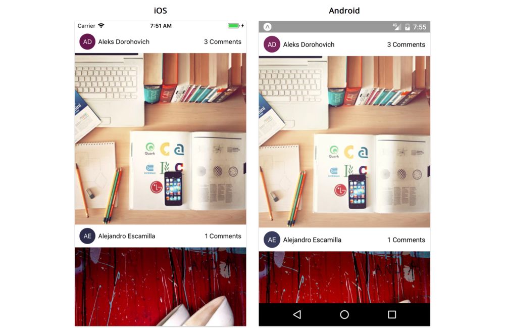
Our app will have two screens. The first screen is the image feed:
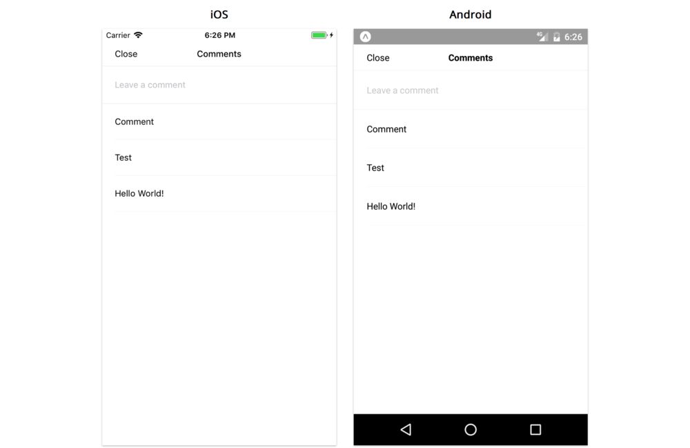
The second screen opens when we tap "3 comments" to display comments for that image:
Project setup
Just as we did in the previous chapters, let's create a new app with the following command:
$ expo init image-feed --template blank@sdk-33 --yarn
Once this finishes, navigate into the image-feed directory.
Choose one of the following to start the app:
yarn start- Start the Packager and display a QR code to open the app on your Android phoneyarn ios- Start the Packager and launch the app on the iOS simulatoryarn android- Start the Packager and launch the app on the Android emulator
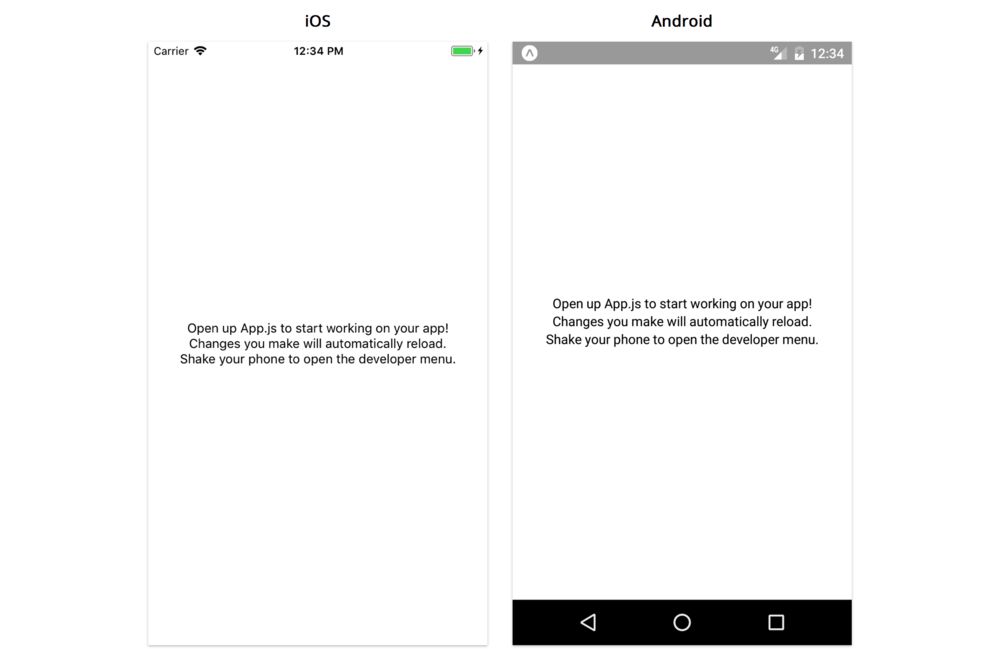
You should see the default App.js file running, which looks like this:
Now's a good time to copy over the image-feed/utils directory from the sample code into your own project. Copy the utils directory into the image-feed directory we just created.
How we'll work
In this chapter, we'll build our app following the same methodology as the previous chapter. We'll break the app into components, build them statically, and so on. We won't specifically call out each step, since it isn't necessary to follow them exactly. They're most useful as a reference for when you're unsure what to do next.
If at any point you get stuck when building an app of your own, consider identifying which steps you've completed, and following the steps more closely until you're back on track.
Breaking down the feed screen
We want to start thinking about our app in terms of the different components of our UI. Ultimately our app will render built-in components like View and Text, but as we learned in the previous chapter, it's useful to build higher levels of abstraction on top of these. Let's start by figuring out how our main image feed might break down into components.
A good component is generally concise and self-contained. By looking at the screenshot we are trying to build, we can identify which pieces are reasonably distinct from others and reused in multiple places. Since we're only building a couple screens, we won't be able to make fully informed decisions about which parts of the screenshots are most reusable as we don't know what the other screens in the app will look like. But we can make some pretty good guesses. Here's one way we can break down the main feed:
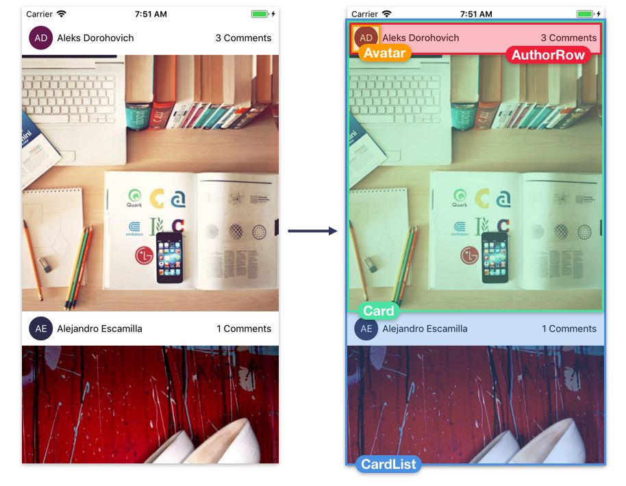
Avatar- The profile photo or initials of the author of the imageAuthorRow- The horizontal row containing info about the author: their avatar and their nameCard- The item in the image feed containing the image and info about its authorCardList- The list of cards in the feed
Each of these build upon one another: CardList contains a list of Card components, which each contain an AuthorRow, which contains an Avatar.
Top-down vs. bottom-up
When it comes to building the UI components of an app, there are generally two approaches: top-down and bottom-up. In a top-down approach, we would start by building the CardList component, and then we would build the components within the CardList, and then the components within those, and so on until we reach the inner-most component, Avatar. In a bottom-up approach, we would start with the innermost components like Avatar, and keep building up higher levels of abstraction until we get to the CardList. Choosing between these two approaches is mostly personal preference, and it's common to do a little of both.
For this app, we're going to work bottom-up. We'll start with the Avatar component, and then build the AuthorRow which uses it, and so on.
Unlike the last chapter, we'll focus on building one component at a time, testing each one as we go. We can modify App.js to render just the component we're currently working on.
As an example, if we were to do this for the Avatar component, we might modify the App.js file to render just the Avatar:
  // Inside App.js
  render() {
    return <Avatar />;
  }
We might also hardcode different kinds of props for testing:
  // Inside App.js
  render() {
    return (
      <Avatar
        initials="FL"
        size={35}
        backgroundColor={'blue'}
      />
    );
  }
Isolating individual components like this is a useful technique when working with styles. A component's layout can change based on its parent -- if we build a component within a specific parent, we may end up with styles that closely couple the parent and child. This isn't ideal, since we want our components to look accurate within any parent for better reusability. We can easily ensure that components work well anywhere by building components at the top level of the view hierarchy, since the top level has the default layout configuration.
Now that we have our strategy locked down, let's start with the Avatar component.
Avatar
Here's what the Avatar should look like, when rendered in isolation:
For simple apps, it's easiest to keep all of our components together in a components directory. For more advanced apps, we might create directories within components to categorize them more specifically. Since this app is pretty simple, let's use a flat components directory, just like we did in the previous chapters.
Let's create a new directory called components and create a new file within that called Avatar.js.
Our avatar component is going to render the components View and Text. It's going to use StyleSheet, and it's going to validate strings, numbers, and color props with PropTypes. Let's import these things at the top of the file. We also have to import React.
We'll import
Reactin this file, even though we don't reference it anywhere. Behind-the-scenes, babel compiles JSX elements into calls toReact.createElement, which reference theReactvariable.
Add the following imports to Avatar.js:
import { ColorPropType, StyleSheet, Text, View } from 'react-native';
import PropTypes from 'prop-types';
import React from 'react';
We import
ColorPropTypefromreact-nativerather thanPropTypes. ThePropTypespackage contains validators for primitive JavaScript types like numbers and strings. While colors in React Native are strings, they follow a specific format that can be validated -- React Native provides a handful of validators likeColorPropTypefor validating the contents of a value rather than just its primitive type.
Now we can export the skeleton of our component:
export default function Avatar({ /* ... */ }) {
  // ...
}
Since this component won't need to store any local state, we'll use the stateless functional component style that we learned about in the previous chapter.
What should the props be for our avatar? We definitely need the initials to render. We also probably want the size and background color to be configurable. With that in mind, we can define our propTypes like this:
// ...

export default function Avatar({ size, backgroundColor, initials }) {
  // ...
}

Avatar.propTypes = {
  initials: PropTypes.string.isRequired,
  size: PropTypes.number.isRequired,
  backgroundColor: ColorPropType.isRequired,
};

// ...
In this app, we'll make most of our props required using isRequired, since we'll always pass every prop. If we wanted to make our component more reusable, we could instead make its props optional -- but it's hard to know which props should be optional until we actually try to reuse it!
It's time to render the contents of our Avatar. For the colored circular background, we'll render a View. The View is the most common and versatile component. We've already used it throughout the previous chapters, but now let's take a closer look at how it works and how to style it.
View
There are two fairly distinct things we use View for:
- First, we use
Viewfor layout. AViewis commonly used as a container for other components. If we want to arrange a group of components vertically or horizontally, we will likely wrap those components in aView. - Second, we use
Viewfor styling our app. If we want to render a simple shape like a circle or rectangle, or if we want to render a border, a line, or a background color, we will likely use aView.
React Native components aim to be as consistent as possible -- many components use similar props as the View, such as style. Because of this, if you learn how to work with View, you can reuse that knowledge with Text, Image, and nearly every other kind of component.
Avatar background
Let's use View to create the circular background for our Avatar:
// ...

export default function Avatar({ size, backgroundColor, initials }) {
  const style = {
    width: size,
    height: size,
    borderRadius: size / 2,
    backgroundColor,
  }

  return (
    <View style={style} />
  )
}

// ...
As we saw in previous chapters, we can use the style prop to customize the dimensions and colors of our View component. Here, we instantiate a new object that we pass to the style prop of our View. We can assign the size prop to the width and height attributes to specify that our View should always be rendered as a perfect square. Adding a borderRadius that's half the size of the width and height will render our View as a circle. Lastly, we set the background color.
In this style object, the attributes are computed dynamically: width, height, borderRadius, and backgroundColor are all derived from the component's props. When we compute style objects dynamically (i.e. when rendering our component), we define them inline -- this means we create a new style object every time the component is rendered, and pass it directly to the style prop of our component.
When there are a lot of style objects defined inline, it can clutter the render method, making the code harder to follow. For styles which aren't computed dynamically, we should use the StyleSheet API. We'll practice this more in the next few sections.
Before that, let's make sure what we have so far is working correctly.
Try it out
Let's add our Avatar component to App. We haven't finished Avatar yet, but it's useful to test as we go in case we've introduced any errors.
Open up App.js and import our Avatar after our other imports:
import Avatar from './components/Avatar';
Next, modify the render function to render an Avatar:
// ...
export default class App extends React.Component {
render() {
return (
<View style={styles.container}>
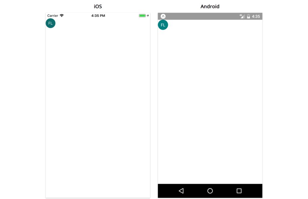
<Avatar initials={'FL'} size={35} backgroundColor={'teal'} />
</View>
);
}
}
// ...
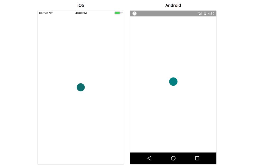
For any props we didn't include, the Avatar will use its defaultProps. We should see a 35px teal circle in the center of the screen:
Regardless of the size of your screen, the teal circle will render in the center. This means React Native is calculating the center of the screen, calculating the dimensions of the Avatar, and using these calculations to properly position the View component. As we learned in the "Getting Started" chapter, the React Native layout engine is based on the flexbox algorithm. Let's start digging into how layout works: how does React Native know the dimensions for each component and where to render it on the screen?
Dimensions
The first thing we want to think about when understanding the layout of a screen is the dimensions of each component. A component must have both a non-zero width and height in order to render anything on the screen. If the width is 0, then nothing will render on the screen, no matter how large the height is.
This page is a preview of Fullstack React Native: The Complete Guide to Building Beautiful React Native Apps
Get the rest of this chapter plus hundreds of pages of React instruction, 4 sample projects, a screencast, and more.