


This post is a part of the React Daily UI post series, a joint effort between Jack Oliver, Sophia Shoemaker, and the rest of the team at Fullstack React. Each day we're explaining in detail how to create a UI component with React.
You can view the Codepen implementation here
Or you view the code on Github here
Welcome to React Daily UI, where we go 100 days building 100 beautiful React applications. We're really excited to be partnering with Jack Oliver who is embarking on this ambitious project with us.
Jack is designing and writing the code for these applications and we're going to deconstruct each one to highlight the features that are unique to React.
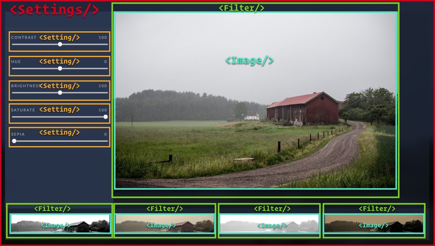
Today we're going to create Reactagram, an Instagram-like app that lets us add filters to our pictures similar to Instagram's "filter" feature:
Overview
The Reactagram application we're building today makes use of CSS filters. The filter property in CSS provides options for blurring, changing colors, brightness & saturation and adding drop shadows to HTML elements. In our application we will learn how to use the filter CSS property to make changes to an image. We are also going to create two reusables components:
-
A
Filtercomponent that allows us to easily apply the CSS filter styles in different ways to the same image. -
A
Settingcomponent that allows us to create a range slider with a customminandmaxset viaprops
Table of Contents

Want to be a pro at building UIs in React?
This post is the first of many that will explain step-by-step how to create professional UI components in React. If you want to become a pro at building UIs in React, put in your email below and we'll notify you as each post is completed.
The filter CSS property
CSS has a filter property that allows us to change various styles of an element on the page. We can add a blurring effect, add a "sepia" tone to the element, change the grayscale, change the brightness and contrast as well as a few other styles. Each of these options are called "filter functions". Each function, when applied, changes the appearance of the element. Here is the full syntax for the filter property:
filter: url("filters.svg#filter-id");
filter: blur(5px);
filter: brightness(0.4);
filter: contrast(200%);
filter: drop-shadow(16px 16px 20px blue);
filter: grayscale(50%);
filter: hue-rotate(90deg);
filter: invert(75%);
filter: opacity(25%);
filter: saturate(30%);
filter: sepia(60%);
These filter functions can also be combined together like so:
filter: blur(5px) brightness(0.4) contrast(200%);
When a web page is loaded in the browser, a few different operations need to occur before the page is actually rendered in the browser. The filtering process happens after all these different operations are finished, just before the page is copied to the screen. The way filters work is they take a snapshot of the rendered page as a bitmap image, then perform some graphics magic on the pixels in the snapshot and then draw the result over the top of the original page image.1
Lucky for us, we just have to add a few CSS rules to take advantage of this filtering magic. We're going to combine the CSS filter magic with a little React magic to make our Reactagram application.
The Settings component
Our Settings component multiple child components with various functionalities. On the left hand side of the screen are a 5 slider controls which allow us to change how the image looks. Each slider control has label and an <input> element with type="range". Range <input> elements have min and max attributes, with default values of 0 and 100 respectively. Our filter functions need min and max values that are different from the default values. Below the main image is a list of preset filters that you can click and change the way the main image looks. On the right hand side of the screen is our main image where our filter is applied. Below the image and settings is a list of 5 filter "presets", which when the user clicks on one will update the filter on the main image. Here is a break down of our components:
Our Settings component has a state object that consists values of the filter functions for our main image on the right hand side. We set the state of our Settings component in our component's constructor function:
this.state = {'contrast':100,'hue':0,'brightness':100,'saturate':100,'sepia':0};
Since we have multiple filters and multiple settings, we are going to create two resuable components -- a Setting component and a Filter component. A reusable component is a component that we can use across different parts of our application and even other applications. The functionality of the component does not require specific scenarios to work properly. There are no hard-coded values in our component that would make it hard to port over to another application. For example, we do not hard code the source of the image we are applying filters to and we do not hard code the filter settings. Instead, we will make use of props to make our component as flexible as possible. We will also set up PropTypes so that other users of the component will have an easy way to see what props are available.
The Setting component
In our Settings component, we have five Setting components. We use multiple Setting components because the CSS filter property has multiple filter functions and we want the user to be able to the change values for all of these different functions. For our purposes, we create inputs for the following functions: hue-rotate,contrast,brightness,saturate and sepia.
<Setting name="contrast"   min={0} max={200} value={this.state.contrast} onChange={this.handleChange}></Setting>
<Setting name="hue"        min={-360} max={360} value={this.state.hue} onChange={this.handleChange}></Setting>
<Setting name="brightness" min={0} max={200} value={this.state.brightness} onChange={this.handleChange}></Setting>
<Setting name="saturate"   min={0} max={100} value={this.state.saturate} onChange={this.handleChange}></Setting>
<Setting name="sepia"      min={0} max={100} value={this.state.sepia} onChange={this.handleChange}></Setting>
Each one passes in multiple props:
- The
minprop defines the minimum value of our slider - The
maxprop defines the maximum value of our slider - The
valueprop uses the currentstateof ourSettingscomponent for each different attribute of the filter property - The
onChangeprop is given a reference to thehandleChangefunction in ourSettingscomponent
We are going to make use of React.Proptypes so that other users of this component will know what is valid value for these props and to aid is in typechecking our application
What are PropTypes?
Creating PropTypes
So users of our Setting component are aware of what props are available on the component, let's set up some React.PropTypes like so:
Setting.propTypes = {
  name: React.PropTypes.string,
  value: React.PropTypes.number,
  min: React.PropTypes.number,
  max: React.PropTypes.number,
  onChange : React.PropTypes.func
};
The onChange handler
In addition to the label name, the min and max values, we also send down two other props that are important pieces of our Setting component. We pass down the value of the <input> element and we also pass down a reference to our Settings component's handleChange function. We do this because when the user moves one of the sliders, we want the parent component (our Settings component) to know that the value of the slider has changed. We pass that value back to the parent by calling this.props.onChange in the onChange event on our input element.
<Setting name="sepia" min={0} max={100} value={this.state.sepia} onChange={this.handleChange}></Setting>
When the user moves one of the sliders, the onChange event is fired, the handleChange function is executed and the state of our Settings component is changed:
handleChange = (e)=>{
  let filter = e.target.id;
  let value = e.target.value;
  this.setState((prevState,props)=>{
    prevState[filter] = value;
    return prevState;
  });
}
The Filter component
Our Filter component is the component that actually applies the CSS filters to the image.
First let's setup the React.PropTypes on our component so users of our Filter component will know what's available on the component:
Filter.propTypes = {
  // An object taking on a particular shape
  filterFunctions: React.PropTypes.shape({
    hue: React.PropTypes.number,
    contrast: React.PropTypes.number,
    brightness: React.PropTypes.number,
    saturate: React.PropTypes.number,
    sepia: React.PropTypes.number
  }),
  onClick : React.PropTypes.func
};
Now, let's set up the functions we'll need for our Filter component:
getFilterCSSStyles function
This function uses a slightly different syntax -- we are using a syntax called "property initializer syntax". If we did not use this syntax, we would need to create a constructor function and bind our getFilterCSSStyles to this like so:
constructor(props){
    super(props)
    this.getFilterCSSStyles = this.getFilterCSSStyles.bind(this)

}
By using the property initializer syntax, we remove the need to use a constructor function in this component. We are also automatically binding the value we need for this (our component), as opposed to a regular JavaScript function which creates it's own value for this.The syntax looks like this:
getFilterCSSStyles = (functions)=>{
As we mentioned above, one of the props our Filter component has is a filterFunctions prop. The value passed into the filterFunctions prop is an object that contains the names and values of all the filter functions we want to use in our Filter component. We need to generate a string from this object that is compatible with the syntax required for the filter CSS property.
We can generate a string with the right syntax by looping over all the keys in our object. We use a switch statement while we are looping over the keys to determine the correct string to generate depending on the filter function we are using. For the hue-rotate filter function, it requires units of degrees, so we'll need to append deg to the filter function value. The other filter functions require units in percentages, so we append % to the filter function value. After generating the string, we return the string we've generated.
getFilterCSSStyles = (functions)=>{
  let filterString = "";
    for (let filter in functions) {
      if( functions.hasOwnProperty(filter) ) {
        switch(filter){
          case 'hue': filterString+= 'hue-rotate(' + functions[filter] + 'deg) '; break;
          default: filterString += filter + '(' + functions[filter] + '%) '
        }
      }
    }
    return filterString;

}
render function
Our render function is fairly simple. It uses the getFilterCSSStyles function we've just described and passes in this.props.functions as an argument. We store the result of that function into a variable and use that variable in the style property in the <div> element in our Filter render function.
let filterstring = this.getFilterCSSStyles(this.props.filterFunctions);
props.children
In JSX, expressions that contain both an opening tag and a closing tag, the content between those tags is passed as a special prop: props.children.2. In our Reactagram application we pass in an <Image/> component to our Filter component like so:
<div className="FilterList">
In our Filter component class, we refer to anything that is contained inside the opening and closing Filter JSX tag by using this.props.children:
return (
This aspect of our Filter component is an important piece so as to make our component reusable accross many types of applications. We can wrap any element with <Filter> opening and closing tags and the filter settings we specify will be applied. Our Reactagram application uses images, but we can also pass in just a <div> or text and the filters will still apply.
The onClick handler
Similar to our Setting component, we want to pass information back to our parent Settings component. When the user clicks on one of the filters in the list of filters at the bottom, we want to send those filter settings back up to our Settings component so it can apply the settings to our main image. We achieve this by passing down a function from our Settings component to the Filter via props:
<div className="FilterList">
Then in the onClick event on our div we call this.props.onClick and pass in our filter function settings -- this.props.filterFunctions as the argument to our function.
In the Settings component, our onClick function looks like this:
updateSettings = (nextFilterState)=>{
  this.setState(nextFilterState);
}
We set the state of our Settings component to update the main image.
Try it out!
Check out the Codepen example:
The complete source for this article is also available on Github here.
To start the app, download the code,
cdinto the project directory and type:npm install npm start
Want to be a pro at building UIs in React?
This post is the first of many that will explain step-by-step how to create professional UI components in React. If you want to become a pro at building UIs in React, put in your email below and we'll notify you as each post is completed.

Learn React the right way
The up-to-date, in-depth, complete guide to React and friends.
Download the first chapter